datjellyman Posted August 27, 2015 Posted August 27, 2015 This could be useful for some of you. It's new and I haven't tried it yet. http://www.nexusmods.com/skyrim/mods/69120/?tab=1&navtag=http%3A%2F%2Fwww.nexusmods.com%2Fskyrim%2Fajax%2Fmoddescription%2F%3Fid%3D69120%26preview%3D&pUp=1
ao2thend Posted August 27, 2015 Posted August 27, 2015 how's my wood looking? Does that sound misleading? Well...um...if your being serious then here's some feedback. The shot is nice and the only two things I'd change is A. the tree texture and B. the tree LOD textures in the background. There are three good tree textures (In my opinion). 4K Tree and Parallax for Pines by Pfuscher: http://www.nexusmods.com/skyrim/mods/64267/? Cover Woods (what I'm currently using): http://www.nexusmods.com/skyrim/mods/60566/? Natural Lighting and Atmospherics for ENB (the optional download section has a nice bark texture): http://www.nexusmods.com/skyrim/mods/50065/? And for the LOD issue, I'd use Dyndolod: http://www.nexusmods.com/skyrim/mods/59721/? Other then that, its a good shot.
Jexsam Posted August 28, 2015 Posted August 28, 2015 Here's a fun exercise. This is a bad screenshot - okay, two, technically, but the only difference is the position of the camera at the time the pic was taken. Semantics! The point is, I want you guys to tell me everything that's wrong with them in your opinion. This is effectively carte blanche to take a bad shot and tear it apart. Offer advice or constructive comments if you want, but this is more about dissecting a bad image than trying to improve it. I'm curious to see what happens. I only ask you refrain from critiquing the character herself - she's a gift from a close friend, very special to me. For that reason, in this specific character's case, I'd prefer you refrain from talking shit about her. (You can say whatever you want about any of my other characters, idgaf.) NSFW, nudity Have at'em.
Buddy Christ Posted August 28, 2015 Posted August 28, 2015 Here's a fun exercise. This is a bad screenshot - okay, two, technically, but the only difference is the position of the camera at the time the pic was taken. Semantics! The point is, I want you guys to tell me everything that's wrong with them in your opinion. This is effectively carte blanche to take a bad shot and tear it apart. Offer advice or constructive comments if you want, but this is more about dissecting a bad image than trying to improve it. I'm curious to see what happens. I only ask you refrain from critiquing the character herself - she's a gift from a close friend, very special to me. For that reason, in this specific character's case, I'd prefer you refrain from talking shit about her. (You can say whatever you want about any of my other characters, idgaf.) NSFW, nudity Have at'em. Well, to me only some things stood out, there probably is a lot more that should, but I do not have a good eye for screenshot composition ^^ For both: There is too much clutter around the character, it distracts me from her. My eyes wander between the caged magic effects, the gems on the table and the parchment. In my opinion both pictures should have a slight diffusing effect on the background to give more feeling of depth. And in both, the left side is too dominating the picture, pulling you away from the character that should be the main focus. For the first one: The round opening in the left background fits so perfectly in the top of the cage that it is even more distracting than the cage alone. It just pulls my eyes there every time I look at the picture. Second one: The cage with the fire magic in it is even more distracting for me now, it seems to be too dominant on the left side of the picture. And in this shot it kind of looks like it is floating, which pulls my eyes towards it even more. Maybe this comes from missing shadows for the objects, but here it is more distracting to me than in the first shot. But like I said, I am not really good at composing a picture, so maybe what I see as "wrong" isn't even "wrong"
Buddy Christ Posted August 28, 2015 Posted August 28, 2015 Hmm, I actually thought that half of her face was in the shadow made for an interesting effect. It gives the face some kind of depth and dimension. If there was a torch or candle in front of her, that would work, I guess. But if something like uhm.... Facelight is it?... was used, it would, to me at least, make the screenshot look like a photoshoot in a studio.
Buddy Christ Posted August 28, 2015 Posted August 28, 2015 Hmm, I actually thought that half of her face was in the shadow made for an interesting effect. It gives the face some kind of depth and dimension. If there was a torch or candle in front of her, that would work, I guess. But if something like uhm.... Facelight is it?... was used, it would, to me at least, make the screenshot look like a photoshoot in a studio. A warm and faint light, such as a candle, would be adequate without upsetting the balance of the shots even further. I think you are right, as long as the play between light and shadow is kept intact. But our little discussion about it shows that "Art, like beauty, is in the eye of the beholder." is true Crucify this one. I am biased on this one, since I am really not a fan of lens flare effects. But the over all motive is something fresh and if the glare on the cross would be tuned down, it would (in my opinion) work better. With the glare it kind of screams "Look at meeee! Look at the cross!" And of course.... no lens flare
Jexsam Posted August 28, 2015 Posted August 28, 2015 Well, to me only some things stood out, there probably is a lot more that should, but I do not have a good eye for screenshot composition ^^ For both: There is too much clutter around the character, it distracts me from her. My eyes wander between the caged magic effects, the gems on the table and the parchment. In my opinion both pictures should have a slight diffusing effect on the background to give more feeling of depth. And in both, the left side is too dominating the picture, pulling you away from the character that should be the main focus. For the first one: The round opening in the left background fits so perfectly in the top of the cage that it is even more distracting than the cage alone. It just pulls my eyes there every time I look at the picture. Second one: The cage with the fire magic in it is even more distracting for me now, it seems to be too dominant on the left side of the picture. And in this shot it kind of looks like it is floating, which pulls my eyes towards it even more. Maybe this comes from missing shadows for the objects, but here it is more distracting to me than in the first shot. But like I said, I am not really good at composing a picture, so maybe what I see as "wrong" isn't even "wrong" I think it would also help to put some kind of light source in front of the character. Therefore, it would make it easier to focus more on said character instead of the busy background. Her skintone and lack of light causes her to blend in with the background too easily as is. Lighting was my first thought exactly when I looked at these later. She's not lit in a way that distinguishes her from the background, so she kind of... blends in to the picture. The light from the levitation thingy frames her head well enough to separate her from the background, IMO, but it doesn't do the image much good. The framing irritates me in all kinds of ways, too. I can't really put my finger on it but the proportions of how everything is spaced feels wrong. The crates to the right are boring compared to the magic-in-a-cage on the left, but those aren't particularly well-placed either. The way her body is arced almost makes it feel like there's a fisheye lens effect on, but only on her.
Buddy Christ Posted August 28, 2015 Posted August 28, 2015 The way her body is arced almost makes it feel like there's a fisheye lens effect on, but only on her. This part did not occur to me as strange in any way. I considered it a normal pose for someone channeling magic into both hands. Well, if you can consider a pose including magic "normal", that is But really, I can imagine her arching her back, while the magical power streams through her arms into her hands. If she just stood straight the pose would lose some of the dynamics that seem to be captured in that moment.
Taskmaster Posted August 28, 2015 Posted August 28, 2015 Here's a fun exercise. This is a bad screenshot - okay, two, technically, but the only difference is the position of the camera at the time the pic was taken. Semantics! The point is, I want you guys to tell me everything that's wrong with them in your opinion. This is effectively carte blanche to take a bad shot and tear it apart. Offer advice or constructive comments if you want, but this is more about dissecting a bad image than trying to improve it. I'm curious to see what happens. I only ask you refrain from critiquing the character herself - she's a gift from a close friend, very special to me. For that reason, in this specific character's case, I'd prefer you refrain from talking shit about her. (You can say whatever you want about any of my other characters, idgaf.) NSFW, nudity Have at'em. She's not well lit and blending too much into the overall scene; which normally wouldn't be a bad thing depending... but given how busy this composition is it looks like a collage spill more than a cohesive image with focus. The magic in the cages are distracting, but if she had matching spell(and color) in her hands, it would've made that part a bit better. The background is more lit than her, especially those boxes. The magic on the left side(her right) and the boxes could've framed her in the image if she stood out instead of blending in. The scene itself is too lively in lighting, which seems to convey a different mood than what the scene suggests(to me). More shadow and dark corners would've helped provide a more brooding atmosphere, that I personally feel would've matched up better in the theme. The nudity distracts and seems like she's nude for no apparent reason, to make me feel it's showing off possible texture and mapping work more than an image trying to say something. As such, her blending in counts against it again. It's still an image that has visual appeal, though, so that's all that really matters in the end. Sans nudity, the shot feels candid. Making it monochrome could help composition where color distracts.
Serithi Posted August 29, 2015 Posted August 29, 2015 -snip- Thanks! Also, regarding Nexus (that character) - and all my characters for that matter - i intentionally don't over-engineer and "perfect" them. I pretty much just roughly eyeball the facial features until they look good and leave it at that, so any flaws per se are left in by design. Keeps things a little more realistic, as opposed to the "unrealistic fantasy waifu #2350" look which... really isn't to my tastes :v. Granted, they're obviously idealized fantasies to an extent. But i'd much prefer my fantasies to actually be in the realm of plausibility. If i were to "perfect" Nexus for example, i'd do some additional tweaks like fix the chin, yeah. But as it stands, she's keeping the weak chin and hard facial features .
GimmeBACON Posted August 29, 2015 Posted August 29, 2015 Thanks for taking the time, I tweaked her eyes a bit and realized I accidentally switched her nose A slight update in appearance Completely off topic, but I saw that UNPFF body, and want it for one of my characters, but I don't want everybody to have it, can somebody recommend a simple and small race mod that I can put that body on. You can use Custom Races and replace the body with my UNPFF body, it's what I do with my main OC. You'll also need to install the XPMSE skeleton (if you use it) and any textures in their appropriate folder. Fortunately, MO makes it extremely easy to use Custom Races. Any good textures that you would recommend for a less then great laptop?
Kaos Wulf Posted August 29, 2015 Posted August 29, 2015 Any good textures that you would recommend for a less then great laptop? Probably some 2k textures. SG + RG is a common choice that has 2k. True Daughters of Skyrim is a very good, underrated texture with a 2k option (will say 'Main' on the download page). Women of Skyrim also has a 2k texture down in the optional section. That's the only ones I can think of off the top of my head.
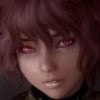
Taskmaster Posted August 30, 2015 Posted August 30, 2015 I don't want to let this thread die, as I'm not delighted on the alternative one. @ao2thend: remember when you said something about Jann's nose in your critique about a week ago? Well, I had smoothed the nose as best as I could at the time, but I never shared any image updates(sorry about that). So, here they are - same exact face, just under various lighting conditions and custom enbpalettes: She's the same, just after attempted nose jaggy smoothing. Anyone is welcome to critique or say whatever they feel. edit: next time I'll post up shots that aren't just portraits
Guest Posted August 30, 2015 Posted August 30, 2015 I don't want to let this thread die, as I'm not delighted on the alternative one. @ao2thend: remember when you said something about Jann's nose in your critique about a week ago? Well, I had smoothed the nose as best as I could at the time, but I never shared any image updates(sorry about that). So, here they are - same exact face, just under various lighting conditions and custom enbpalettes: She's the same, just after attempted nose jaggy smoothing. Anyone is welcome to critique or say whatever they feel. edit: next time I'll post up shots that aren't just portraits In overall, I think she looks really unique (as she ever was), but I have 2 concerns: 1. The brows are too sharp and their angle makes her look permanently irritated/annoyed 2. The lips gloss seems unnecessary
Kshahdoo Posted August 30, 2015 Posted August 30, 2015 Alright, guys. I want to hear your opinions about my character (all of you known her very well). Why you hate something, what should i improved and etc.
Kaos Wulf Posted August 30, 2015 Posted August 30, 2015 Here's one pic The character has always struck me as a believable Asian inspired(or Akaviri since this is Skyrim) woman. As for the shot, the glare is just too distracting; becomes the focal point rather than the character herself. It could either be toned down, or you could position her a little to the right (her left).
ettorg Posted August 30, 2015 Posted August 30, 2015 Here's one pic ~snip~ You've always had a great looking Asian-like character in your shots. There's only two things I recommend: that large piercing hanging on her face hides some of her natural beauty. She can manage without it. And given her facial structure, I'd avoid using hairs with large bangs. That hairstyle covers up too much of her forehead, making her face seem smaller than what it really is. For example: in this shot from the SYSC thread, this hairstyle complements her facial features more. I often change hairstyle and i agree with you, the nosechain is just for fun, thanks. Kaos Wulf: Maybe, this place is very frustrating because there's not much place (between "aqua-balls"). btw, thank you
Taskmaster Posted August 30, 2015 Posted August 30, 2015 I don't want to let this thread die, as I'm not delighted on the alternative one. @ao2thend: remember when you said something about Jann's nose in your critique about a week ago? Well, I had smoothed the nose as best as I could at the time, but I never shared any image updates(sorry about that). So, here they are - same exact face, just under various lighting conditions and custom enbpalettes: She's the same, just after attempted nose jaggy smoothing. Anyone is welcome to critique or say whatever they feel. edit: next time I'll post up shots that aren't just portraits In overall, I think she looks really unique (as she ever was), but I have 2 concerns: 1. The brows are too sharp and their angle makes her look permanently irritated/annoyed 2. The lips gloss seems unnecessary Hmm, you're right. I'll make some adjustments and post up later.
Recommended Posts
Archived
This topic is now archived and is closed to further replies.