Jump to content

Radier Reform Update


DocClox

1,142 views

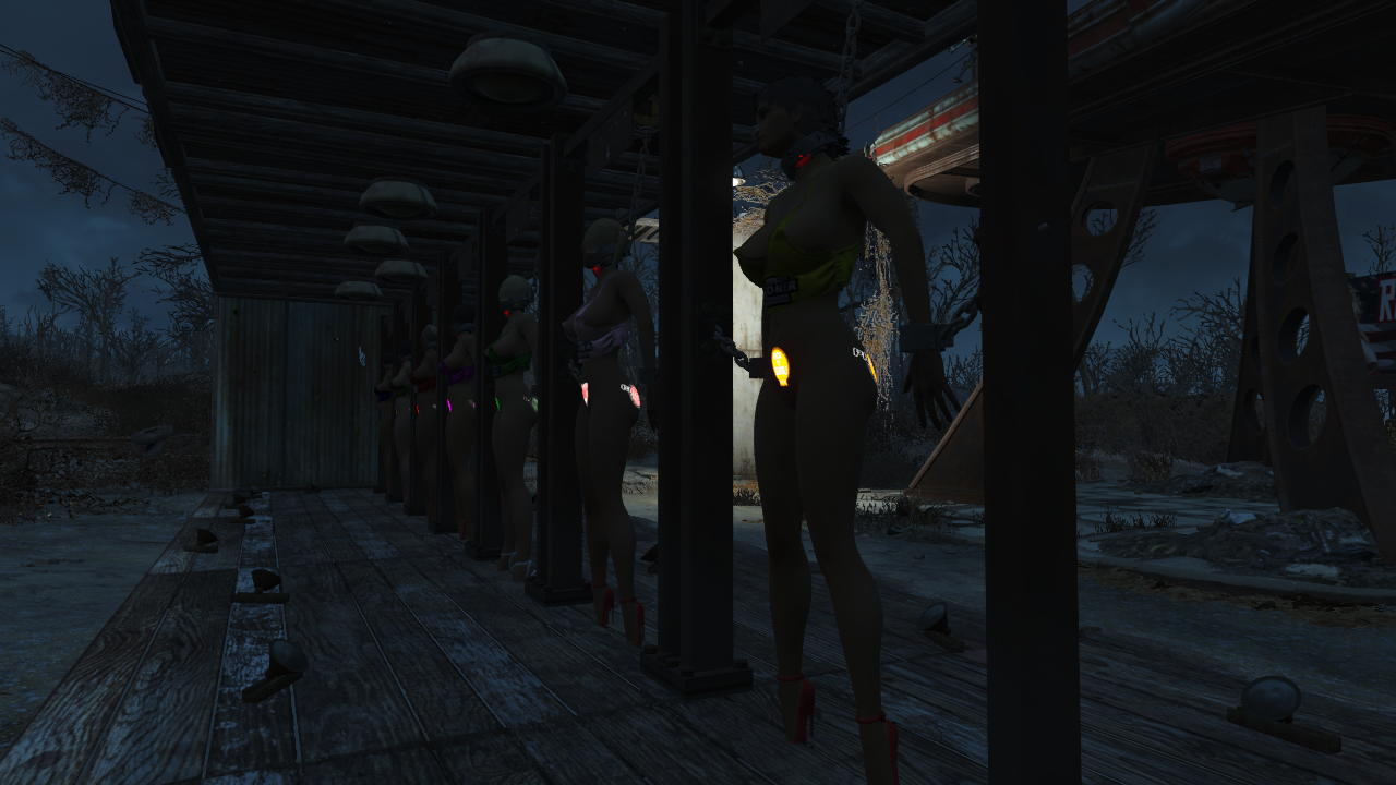
I found out how to make color tattoos using LooksMenu.


ScreenShot520.png


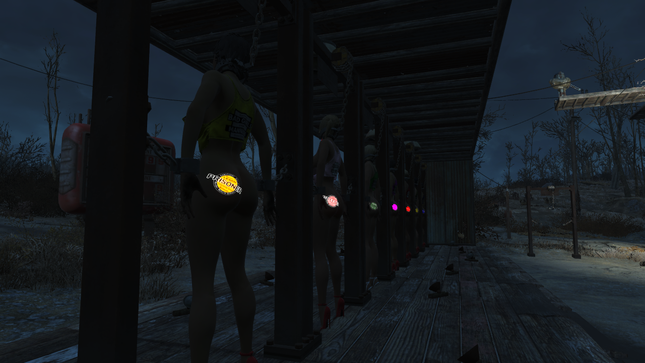
An unexpected side effect is that they glow in the dark!


ScreenShot521.png


It does pose some problems though. Designs that work perfectly well as B&W images fuzz right up. I assume because the glow messes things up.


image.png


But then others are just fine.


image.png


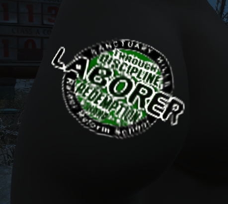
And sometimes, honestly, it just seems to depend on the mood the game is in. I've seen this design render much better that this without changing a pixel in the texture.


image.png


For example:


image.png


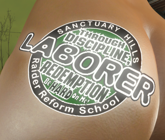
Same tat, nothing changed, but a world of difference in readability. Not sure what the difference is. Logically I must have changed something.


I had intended to show off the color designs, but it hadn't fully sunk in how rubbish these screenshots actually were. I need to do some more work there, I think.


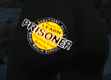
Just so this isn't a total waste of space, here's the out of game designs:


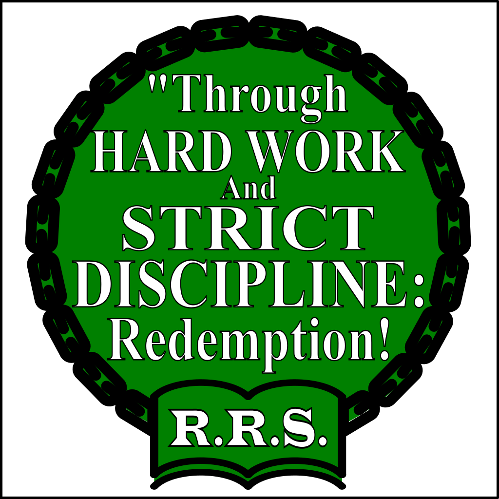
Prisoner: ass and mons tats. The color is a work in progress and not the one in the screenies. More muted shades tend work better, probably because they glow less. I'd sooner have them readable and non-glowing.


ass_sample.png  mons_sample.png


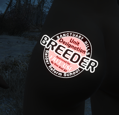
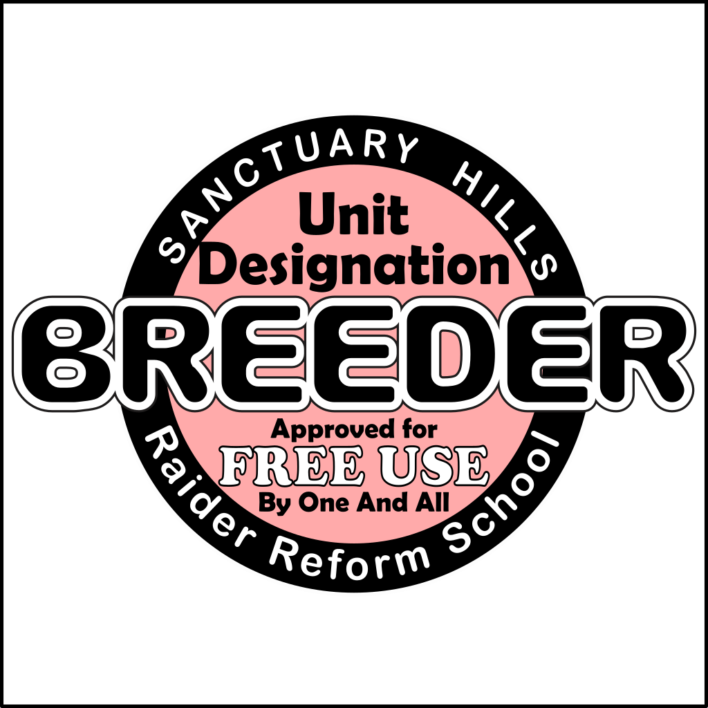
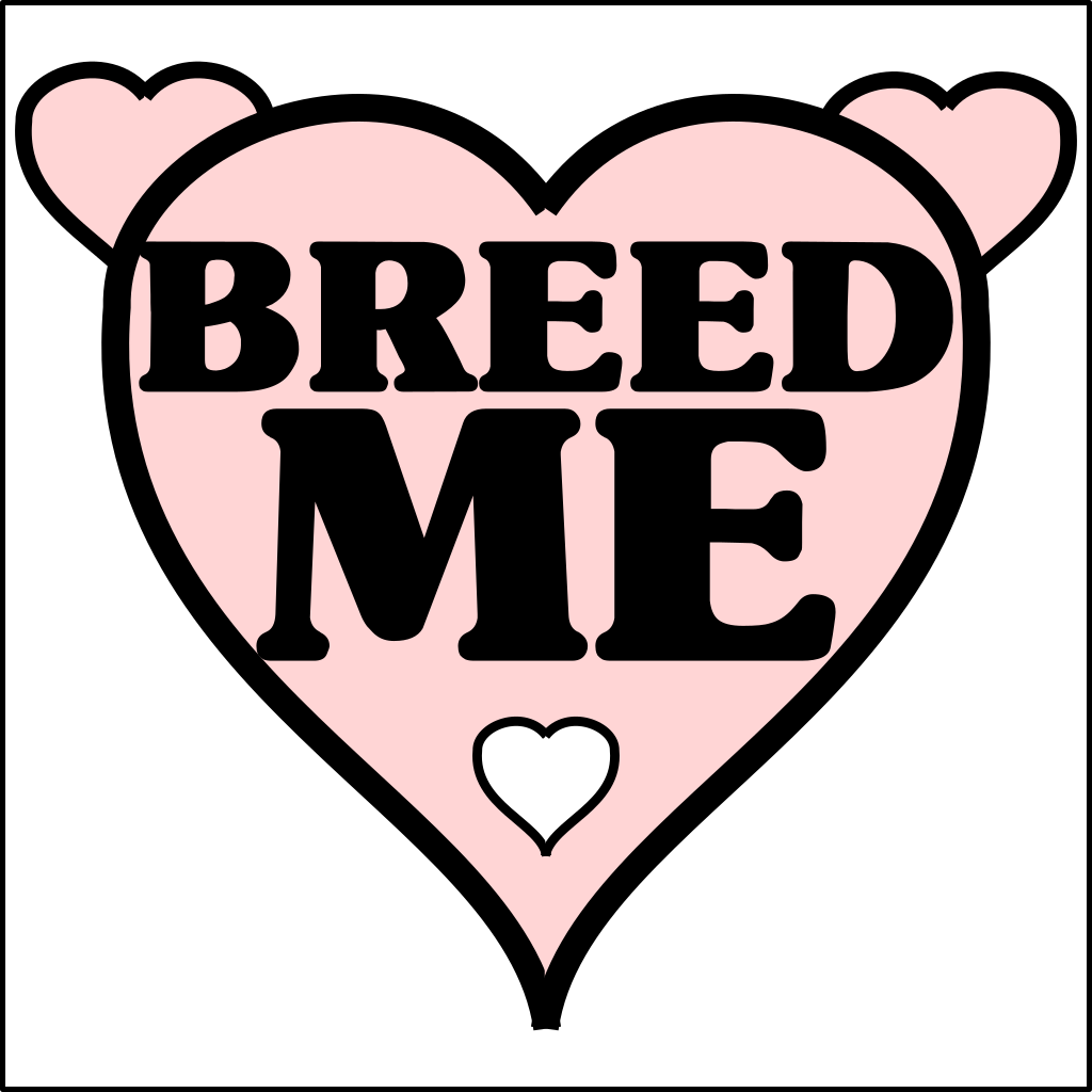
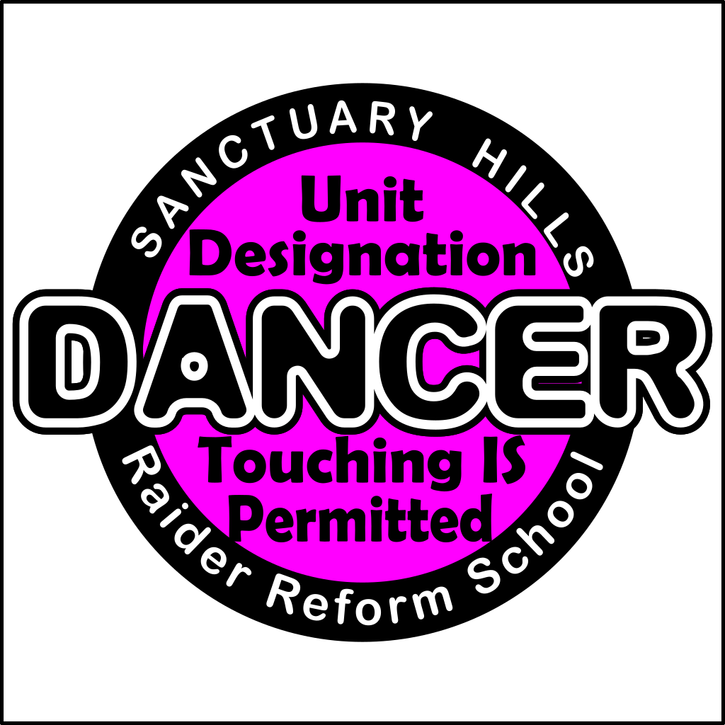
The breeder ones haven't really changed from the first attempt:


ass.png  mons.png


Laborer: The frosty effect around the text was an unexpected side effect of setting an outline color for the font. It looks nicely dramatic, but I'm not sure something with more gravitas wouldn't work better. Also, all that noise probably doesn't help with the glow overwhelming the message.


The mons brand looks good on paper, works in B&W, but the lettering gets lost in color. Maybe black text and a white outline. With a slightly chunkier font.


ass.png  mons.png


Next one. The glow particularly tends to overwhelm the mons detail, once again.


ass.png  mons.png


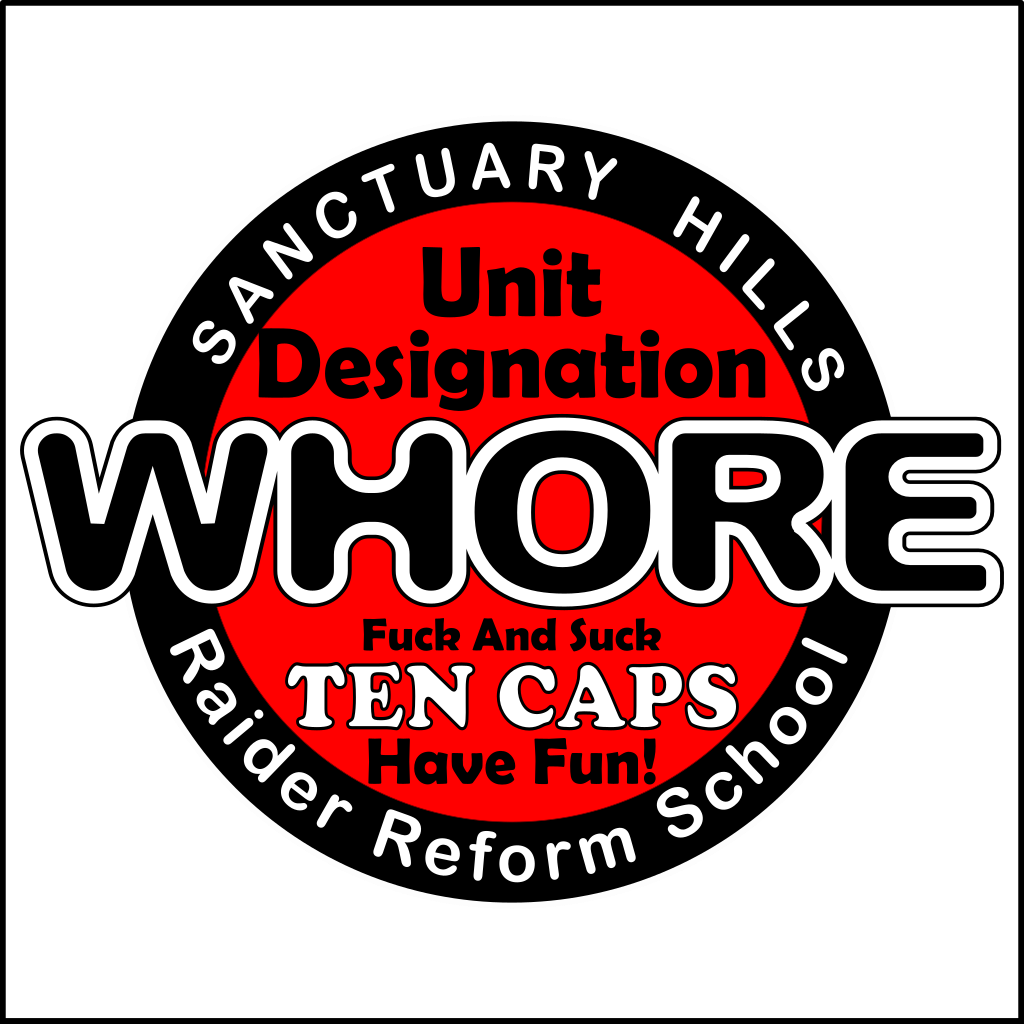
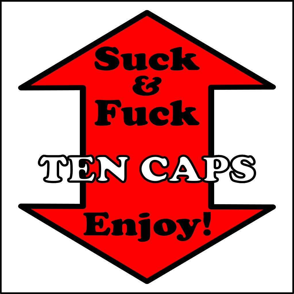
The Whore design seems to work fairly well still. The "Ten Caps" on the mons probably needs to be black text. Maybe with the other text in white.


ass.png  mons.png


Security went through a few different versions. My pretty much happy with the text now, and the design works better than most in-game. Only issue is I couldn't do camp pattern when I'm limited to one color, so I went for olive drab instead. It seems to work.


ass.png  mons.png


Slave is still a work in progress.


ass.png  mons.png


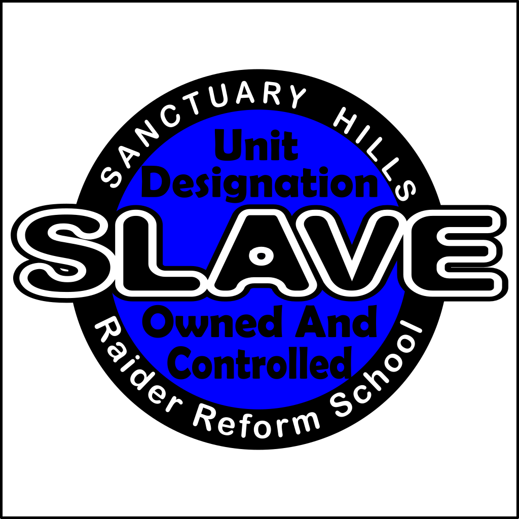
But I'm reasonably happy with it.


Is anyone actually finding this interesting? It's useful for me as a note-keeping exercise, and I'll probably keep on doing it but if no-one else is reading, I'll stop worrying so much about making it understandable to others. On the other hand, if folks are reading, I'd welcome feedback on the designs.


5 Comments


Recommended Comments

Quote

 Logically I must have changed something.

Is it all in BC7 rgb? Did you change compression on the dds files somewhere? I can't remember how GIMP does it, but paint.net remembers the last compression you saved in and automatically saves using that one, regardless of what the file was in when it was opened. It makes going back and forth between Skyrim LE and SE a bit irritating.

Link to comment

BC3/DXT5. There isn't an explicit BC7 on offer from the Gimp.


How do you set dds settings in paint.net again? I've done it before, but that was ages ago.


(I remember there was one I had to save as "dds2" and then change the extension...)


Oops! Never mind. I remember now. You need to choose the filetype from the dropdown. It doesn't do the Gimp's trick of taking the filetype from the extension.


That might well be the problem.

Link to comment

OK. That seems to help. The other thing that I think was causing issues was mipmaps. I was tending to try and avoid having NPCs photobomb me by standing some way away and then freezing time with tfc 1 and moving in to take the pic. Only I don't think the mipmaps were being updated because "I" was so far away. Which explains why some of those were so horribly distorted.


When I move physically up close, I get shots like this:


ScreenShot569.png  ScreenShot570.png


ScreenShot571.png  ScreenShot572.png


ScreenShot573.png  ScreenShot574.png 


ScreenShot575.png


So that's one mystery solved. Probably two.


I still need to think about some of the glow in the dark effects:


ScreenShot576.png vs ScreenShot561.png


one the one hand. (Yes, I rigged the lighting with a switch so I could test both ways ...) But then


ScreenShot565.png  ScreenShot577.png


... actually, that's better both ways than it was before. Probably still help to tone the color down a bit, but otherwise, that could work.


Link to comment

Radioactive works for me. I'll have to start looking for a lead lined bollock protector.


Then again, what else is Radaway for?

Link to comment
×
×
  • Create New...

Important Information

We have placed cookies on your device to help make this website better. You can adjust your cookie settings, otherwise we'll assume you're okay to continue. For more information, see our Privacy Policy & Terms of Use