About This File
First and foremost, this modders resource requires Adobe Photoshop
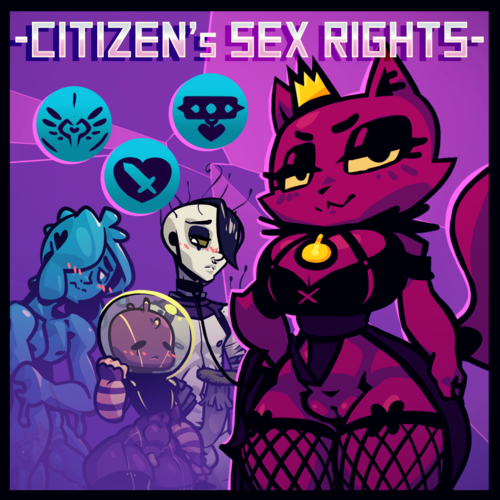
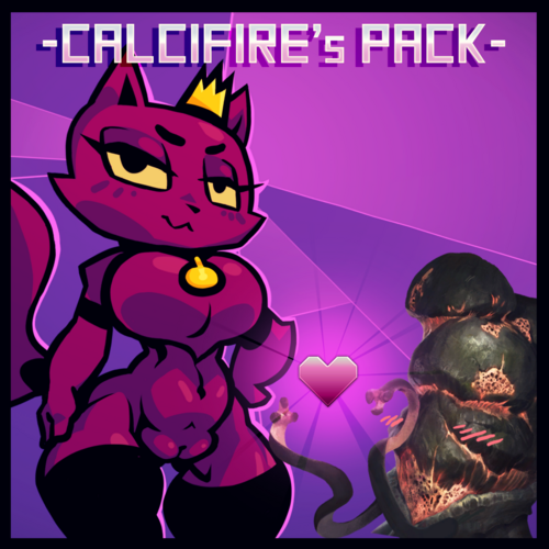
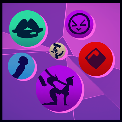
Also... All the example icons provided in the .psd's are free for everyone to use. I've pretty much released every single icon I drew when creating the traits for my Portrait Pack
While you are free to use them however you want, the primary benefit are the methods and tools in here are for the creation of new icons that I will now go into how to utilize...
File Formats::
Both .dds and .tga formats will make use of the "alpha channel" embedded within. Though they may look like plain squares inside photoshop... Trust me. They will export as either their round or hexagonal shape when you export them to those image types.
This is great, because you can essentially draw outside the margins with no consequence (just don't draw outside the canvas, remember to crop if you are seeing artifacts around the edges)
"_trait.psd" will provide you will circular and "_civic.psd" will provide you with hexagonal icons
If you want to export .dds files for your icons, I recommend using these settings... 8.8.8.8 ARGB 32 bpp | unsigned - 2D Texture - No MIP maps
If you want to export .tga files for your icons, just remember that Stellaris doesn't look for those by default and you need to call for them specifically in your "_species_traits.txt" files with... icon = "gfx/interface/icons/traits/trait.tga"
(I recommend using .tga files if you don't have any .dds plugins for photoshop. Or if you are like me, you use .tga because they are lossless with no compression)
Image Resolutions::
Paradox uses 29x29 pixels for it's icons (yeh, no shit, Cal)
I recommend using "Bicubic Sharper" for your Resampling Setting when reducing the full sized images into their icon form
Note that, the subtle glow around Paradox's icons are barely visible when you are working in the 464x464 pixel .psd files I provided... All this means is that make sure you don't merge the layers before you reduce down to 29x29. This can give you weird artifacts during the resampling, so always keep your layers loose.
Colors::
While Paradox Interactive slightly changes what colors after every update, I did my best to color match the general feel of the vanilla icons from over the years.
You might also think the graphics themselves are just plain black drawings, Paradox actually does add a subtle color shade to them. This becomes obvious like when say, you mix the dark red icons with a green background. It's may not seem like an appreciable difference, but if you want to match the source material as much as I do, you'll make the conscious effort to meet that standard Paradox set.
Making your own Icons::
You may have also noticed that when viewed in their full resolution, a lot of my artwork looks pretty bad, but you can hardly notice that when they are in their tiny little 29x29 forms. In fact, some choices that look down right awful actually end up looking BETTER when you crunch it down to size. Exactly how and why this works is just something you'll have to discover through experimentation when drawing your own icons. So whether you have any skills or not, makin icons is actually very forgiving.
Anyway, that's it. Hope this helps somebody out there!
*wait, wtf? when I open this, photoshop had to convert it from an older version... Wait, you made these in photoshop CS3?!?!?!... WAIT, DID YOU DRAW YOUR ENTIRE PORTRAIT PACK IN CS3!!! That's from like 2007, dude, WTF!!!!*
-Hey man, adobe is expensive.