About This File
Summary:
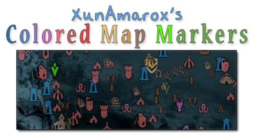
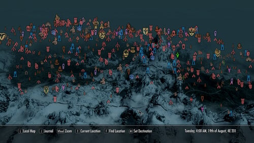
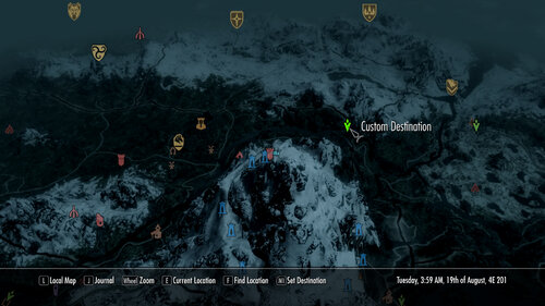
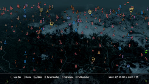
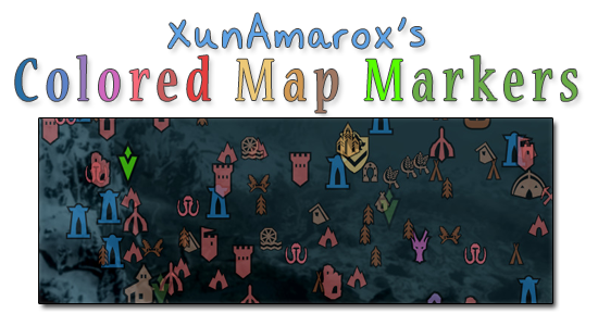
Contest winning map marker design based on EzEs Colored Map Markers. SkyUI 4.1 & all DLC compatible. Colored compass & unvisited markers included.
Required:
SkyUI 4.1 - May not actually be required... If you don't use it, let me know if it works alright without it.
I'm not sure how it'll do on older versions of Skyrim since there are markers from Dragonborn & Dawnguard. I'm also not sure if not having those DLC will affect it.
Design:
I started out with the idea that not everything needed unique colors because it becomes overwhelming and confusing and similar places should share colors to reduce clutter and make things easier to find on the map. So to do that I went through and reorganized the whole thing to make sure it all made sense. I tried to use mostly desaturated warm colors to that end. As for the coloring itself... I went with a yellow/orange (same spectrum) combination for the Major Cities & Palaces because I wanted them to be visible but not obnoxiously colorful, but still look related (e.g. same spectrum). They could have been about any color, but I thought a warm color would go best with the rest of the colors I chose which were also in the warm color spectrum.
I went with a very desaturated light brown color to indicate settlements because they're things that shouldn't really stand out that much and aren't a threat, so they should have a very mild color. For dungeons (e.g. very dangerous places) I gave them red as per the natural color response stimuli of red meaning danger so it indicates that the places is probably going to be hostile and dangerous, but I kept it very light and desaturated since these places are numerous as to not overwhelm the map with colors and become overly obnoxious... For the other world locations I went with a darker brown since they're more important than settlements though generally not as hostile as the more dangerous locations. The dark brown is a bit more vibrant, but brown tends to not be a color people associate with colorful and vibrant, so I figured it wouldn't draw too much attention other than making them noticeable.
As for the couple of special things, I wanted them to be very identifiable. Daedric Shrines are very rare in the world and attributed to Daedric Princes, so I wanted that to really stand out on its own. Dragon Lairs, a very dangerous and very unique set of places on the map and there aren't that many of them. With the Doomstones, I wanted these to have their own color and stand out more than other things because being able to find and change one's sign is pretty important. Giant Camps I made a lighter slightly more saturated red than the dungeons because they aren't really dungeons, but they're still extremely dangerous places. As for Stormcloak/Imperial camps, I wanted to give them their side's respective colors: red and blue.
Now, the player markers... Those are things the player is going to be seeing all the time and they tend to be vitally important. That's why I chose to go with green for the markers indicating places the player needs to go, since I made sure not to use the green spectrum anywhere else on the map so they would be noticeable. I left the generic markers a desaturated green, but made the player's custom marker a very bright green to be still in the same spectrum of normal markers, but to really pop out. I made the locked door thing an orange-ish color to indicate you can't go that way or it needs a key or whatever so it would be obvious but not stand out too much. And the player marker itself... I was actually really iffy on that. At first I had it a really bright red to make it stand out, but after I went with red for dungeons and Imperial camps I decided it might get too washed out and be hard to find... so I gave it a unique color. I went with the blue spectrum since very few things used that, but went much brighter so it'd be immediately noticeable and really pop out.
History:
Back in November of 2012 I won a design contest for the next new design of EzEs Colored Map Markers (linked above). I've used it ever since - I love it. Unfortunately when xEightballx updated his mod for SkyUI 4.1, much to my dismay, mine was never included. I completely understand -- it took me hours to do just this one while xEightballx was juggling 12 different versions. Insanity!
It makes sense to me in retrospect why only a handful were chosen to be updated and also why he does not include unvisted markers or the vast majority of compass markers. If you just do the map's discovered markers that's 1/2 of one page. If you do what I've done however, it's a full page for both the discovered and undiscovered markers, and then that is doubled because I did them for the compass as well. So my one map marker set that I'm uploading now is probably equivalent to about 4 of the others in terms of how much was done.
Making these colored map markers is not hard. It is however tedious and time consuming. If you want to know how to do it yourself, it's really so simple anyone could do it; xEightballx has a video tutorial on how to do it, so check it out if you're interested. I couldn't have made this without it.
The biggest problem for me using SWF Decompiler is that it doesn't play nice. Ctrl+A and Ctrl+V don't work so I have to manually highlight then right click and choose paste every time and every single time I have to select Solid from a drop down on what type of fill I want to do. Then, pretty frequently all the thumbnails will just disappear so I'd have to close the program and re-open it. Then, sometimes it refused to fill some markers at all and I had to go into select and individual groups and ninja my way around it. Tedious, time consuming, and a lot of work done exclusively with one hand since your other is completely useless.
All of that said, with the stark reality that EzEs markers will likely never be updated with mine ever again and xEightballx's video tutorial found I decided to just do it all from scratch myself, updated for SkyUI 4.1 and all the DLC's.
I actually had to redo the compass markers 3 times because first I started on the one included with EzE's which was horribly outdated, then I did it on the one extracted from my Interface bsa file, and then finally once more on the one from my Update bsa file. I'd gotten at least 80% done on each of those so yeah.. I was ready to start banging my head against the wall.
Changelog:
1.1 - Shape 307 which was previously thought unused (3 quest pointers stuck together) was colored (it's used one time, when you're sent to talk to Arngeir for the Peace Council I believe, or something like that). So, just minor update. You probably won't even notice, but I've got you covered anyways. ![]()
1.0 - Initial release
Credits:
xEightballx's video tutorial on how to edit Skyrim SWF & GFX files. I couldn't have made this without it. Also, he should be credited for the contest which inspired me to originally design my own map marker scheme.


